


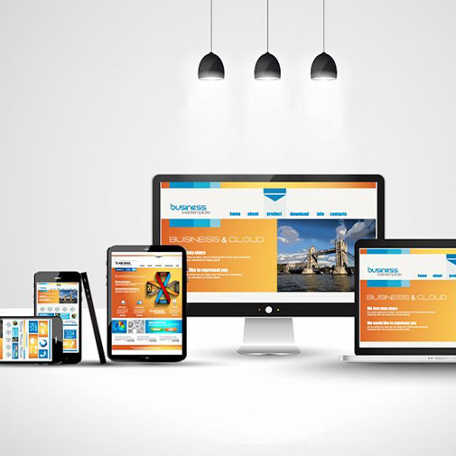
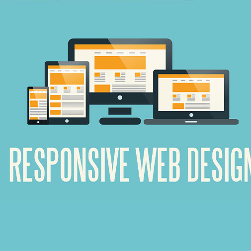
Welcome to our responsive website design services! In today's fast-paced digital age, the way people access websites has evolved, with users relying on a variety of devices, from desktop computers and laptops to tablets and smartphones. Having a responsive website is no longer an option – it's a necessity to ensure your online presence remains effective and engaging for all visitors. Our team of highly skilled designers and developers is dedicated to creating websites that effortlessly adapt to any screen size, delivering an exceptional viewing experience to every user.
With mobile usage on the rise, it is essential to prioritize mobile-friendly designs. Our team follows a mobile-first approach, which means we focus on designing for the smallest screens first and then gradually enhance the layout for larger devices. By prioritizing mobile users, we ensure that your website is optimized for the ever-growing number of mobile visitors, offering them a seamless and user-friendly browsing experience.
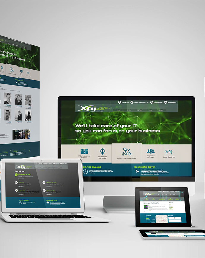
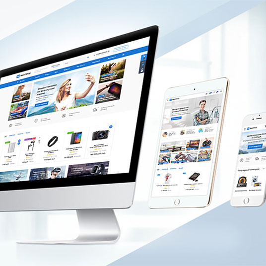
We believe that every business is unique, and your website should reflect your brand identity and vision perfectly. Our custom responsive web design services ensure that your website not only looks visually appealing but also functions flawlessly on desktops, laptops, tablets, and smartphones. We work closely with you to understand your business goals and target audience, tailoring the design to meet your specific requirements.
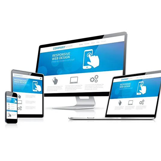


Our design process follows a mobile-first approach, putting the needs of mobile users at the forefront. With the increasing number of people browsing the web on their smartphones, we prioritize designing for the smallest screens first and then progressively enhancing the layout for larger devices. This ensures that your website is optimized for mobile users, providing them with a seamless and enjoyable browsing experience.
Beyond diverse devices, websites are accessed via a spectrum of web browsers. Understanding this digital diversity, our responsive designs undergo meticulous scrutiny, subjected to rigorous testing across renowned platforms such as Google Chrome, Mozilla Firefox, Apple Safari, Microsoft Edge, and others. This intensive regimen ensures an impeccable cross-browser compatibility, guaranteeing that your website maintains a uniform appearance and seamless functionality across all major browsers.


At the core of our design philosophy lies the adept utilization of fluid grids and flexible images. These elements form the bedrock of our responsive layouts, orchestrating a dynamic dance that seamlessly adapts and scales in harmony with the user's screen dimensions. This meticulous approach guarantees that your website's content retains its clarity, legibility, and aesthetic allure, unconditionally embracing the diversity of devices that grace its digital stage.
In a realm where mobile devices are the gateways to digital exploration, our focus extends to touch-based interactions that transcend the ordinary. Our meticulous approach ensures that your website's buttons, menus, and interactive elements are thoughtfully optimized for effortless touch inputs. This deliberate refinement isn't just about accessibility; it's about crafting an experience that's intuitive, seamless, and thoroughly engaging for users navigating through the tactile canvas of their devices.


Fast-loading websites are essential for providing a positive user experience. Our responsive designs are optimized for performance, ensuring that your website loads quickly on all devices. This not only enhances user satisfaction but also positively impacts search engine rankings.
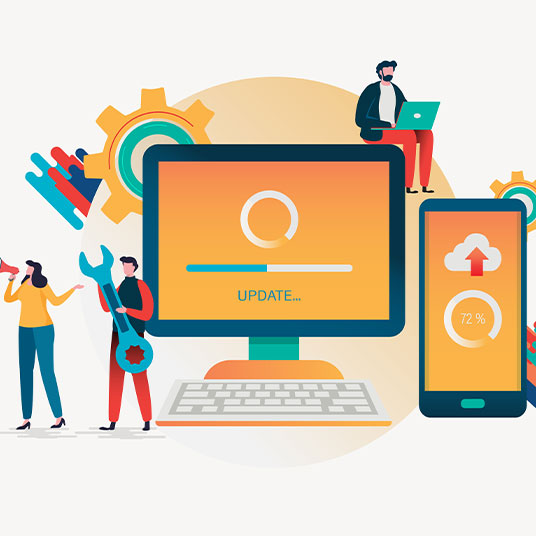
Our allegiance to your website's triumph extends far beyond its launch. We extend a steadfast hand of ongoing support and continuous updates, ensuring that your responsive website perpetually operates at its zenith. This commitment isn't confined to a mere moment; it's a journey of consistent excellence that safeguards your website's performance and propels it to adapt to the ever-evolving digital tapestry. In the dynamic realm of the web, maintenance isn't an afterthought – it's a strategic imperative. Our regular upkeep routines and updates aren't just about ensuring the lights stay on; they're about fortifying the walls, securing the gates, and fostering an environment that thrives in the face of digital challenges.

Book your personalized session now to explore how we can achieve your goals together.


Copyright © 2024 SPCreaters. All Rights Reserved.